Viralogue
A brand new viral research lab in Colorado needed a website to announce its launch. And though they didn’t know it, they also needed a name and a logo. I designed and implemented this brand and website in. 11 days. This involved providing creative direction, copywriting and graphic design to help showcase the potential of this lab.
A unique approach
When the head of the research lab reached out, we realized we had an interesting challenge ahead of us. In a way, his reaching out to me was his way of rebelling against all the mundane lab websites out there. He wanted a way to attract the best talent, collaborators and investors by communicating the divergent thinking that was the USP of both himself and his lab.
There were three main target audiences:
The first group would be students at the university where his lab would be based, who would apply to join the lab to do research work.
The second group would be collaborators– people who worked in research labs or fields of work adjacent to his, who might be interesting in working with his lab on various projects.
The third group would be potential investors who found his research interesting and engaging enough to want to possibly fund further research projects.
The conclusion was that the website and lab’s digital persona needed to be professional in tone, well designed and had enough personality to make people want to reach out and be a part of it in some way, shape or form.
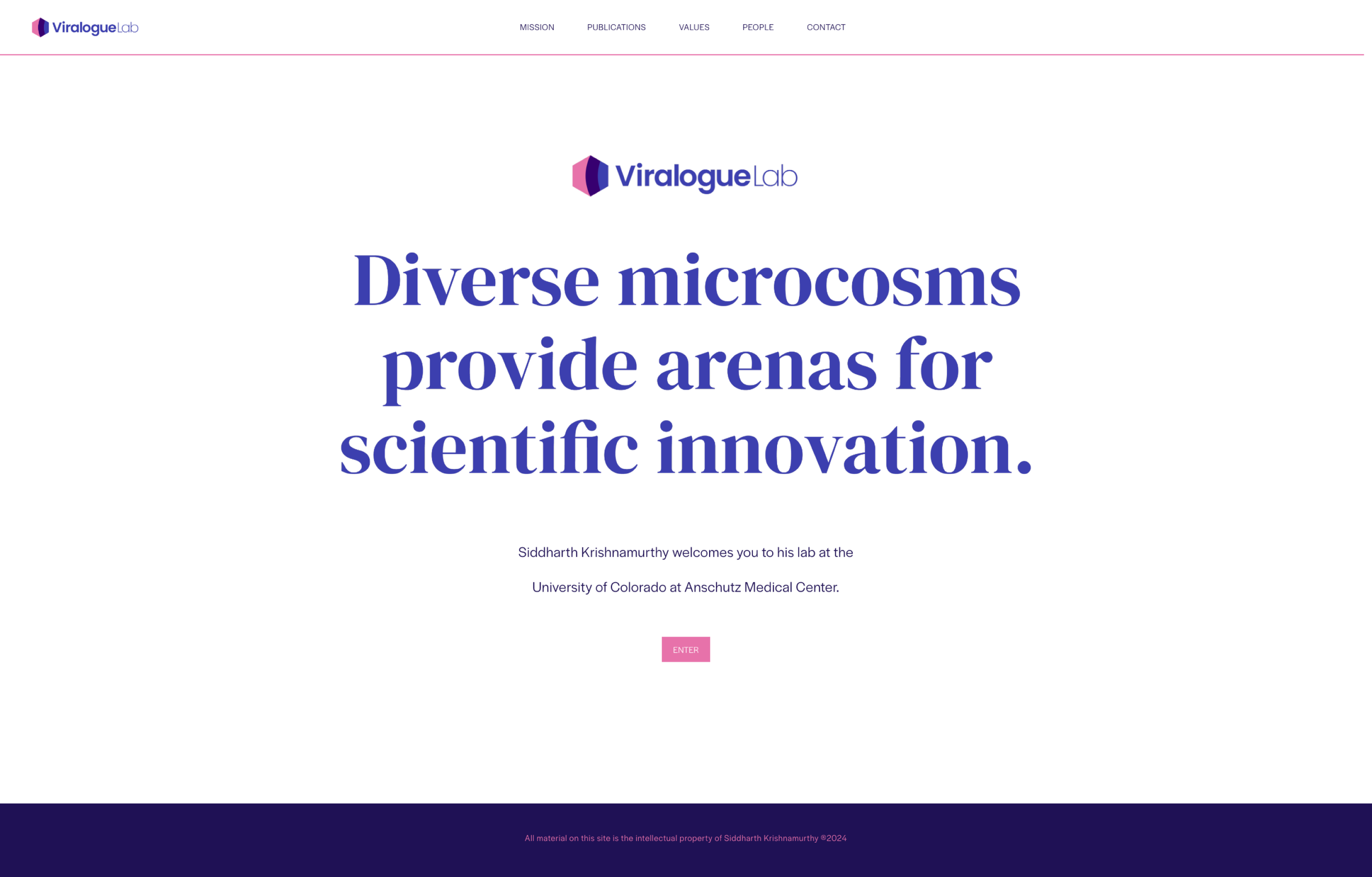
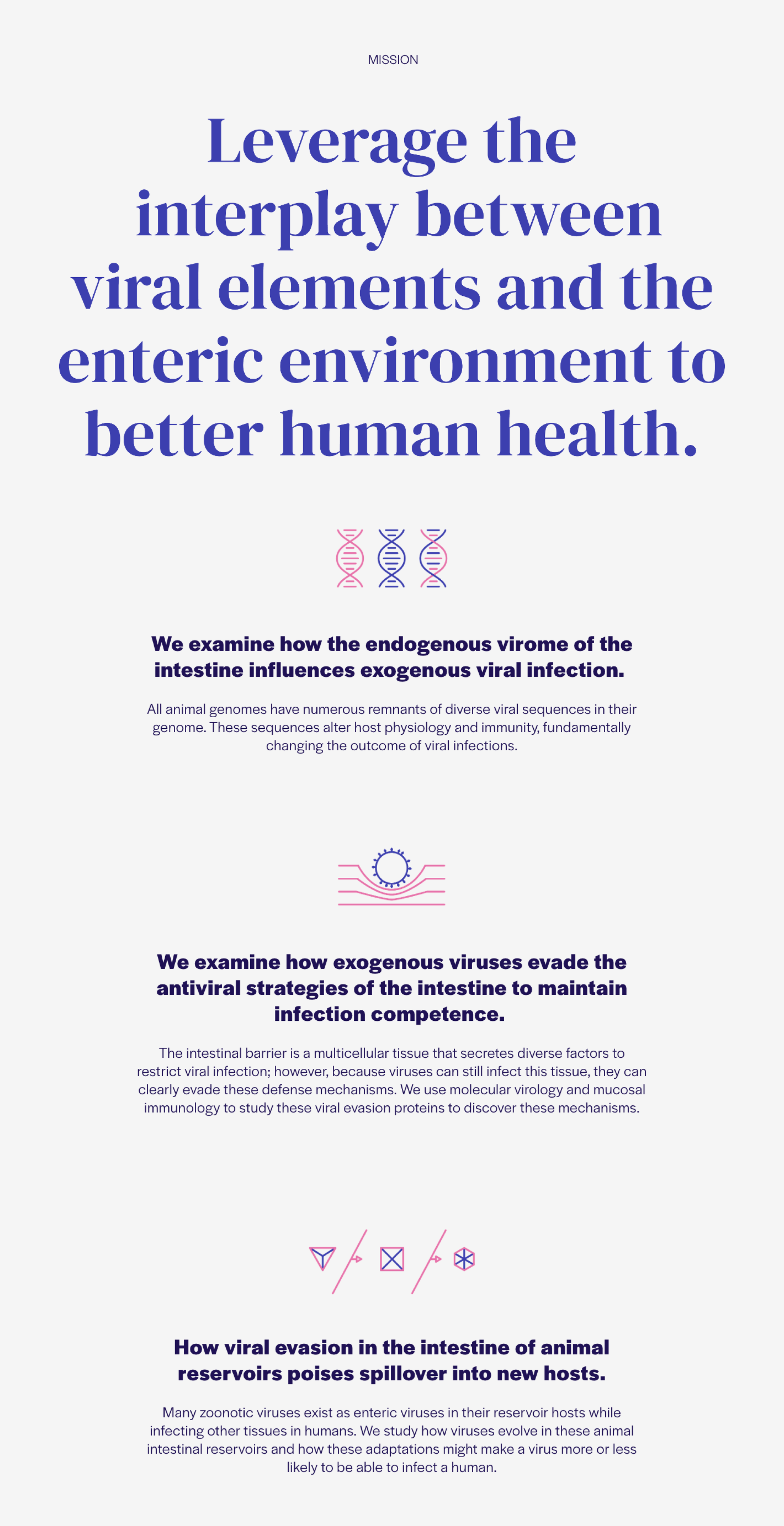
The lab's Mission
Each page on the site needed to have a bold statement as the page header. This statement was meant to set the tone as well as provide insight into the lab’s culture.
I worked with the head of the lab to understand the different aspects of what he wanted the lab to achieve, not just in terms of scientific research but beyond that. One of the challenges was the task of injecting some personality into highly technical, yet necessary, information on the site. The information had to be conveyed accurately, but still be friendly and solicit more interest from the reader.
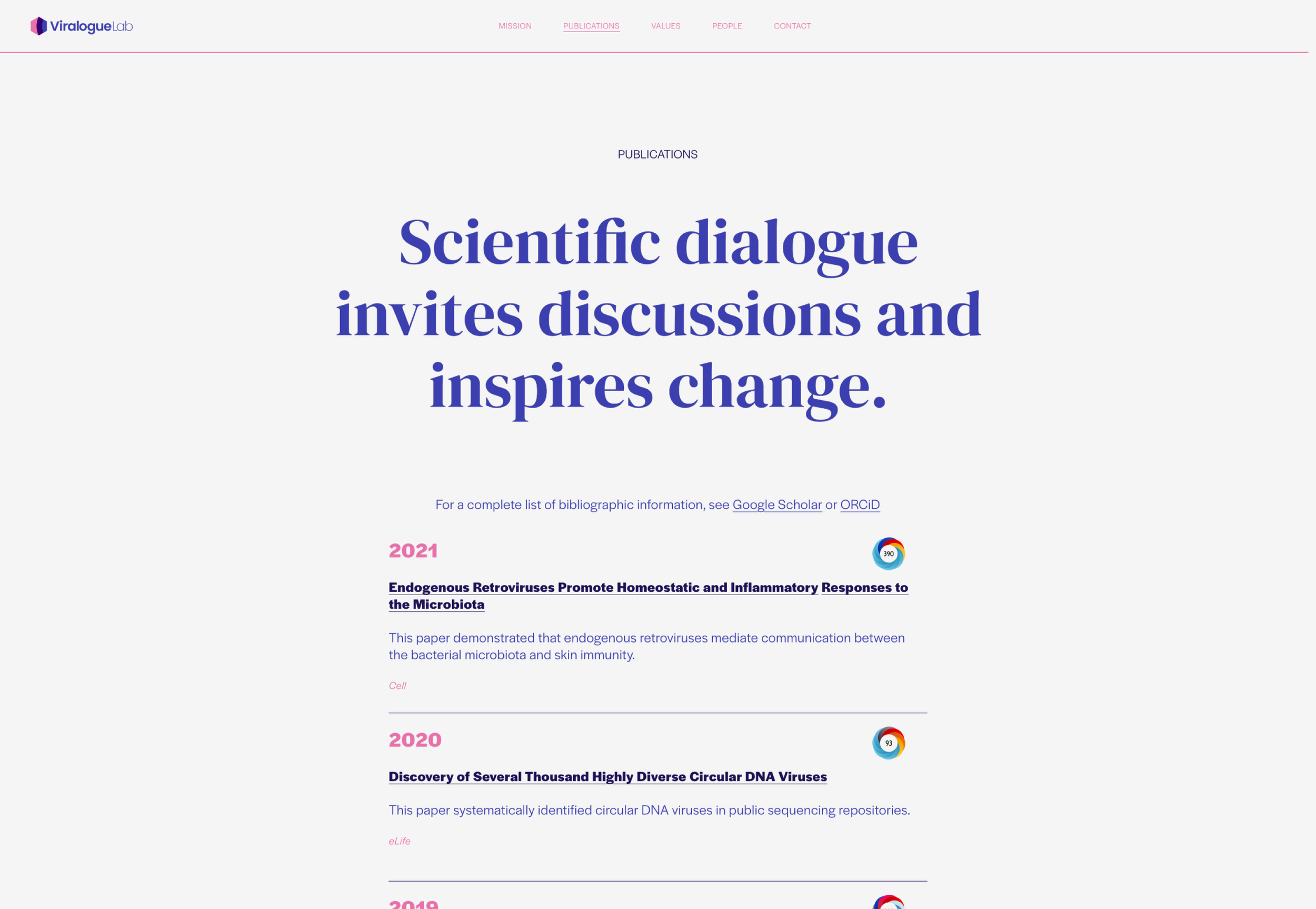
Published scientific papers
The goal of the header copy here was to make the connection between the core reason behind why technical research papers are published in the scientific community– which is to take a position on a particular topic, through research, and then to share it publicly, inviting dialogue and debate.
This is how science makes progress– by being brave enough to be proven wrong. In publishing multiple papers, the principal of a lab proves their mettle and earns the right to lead.
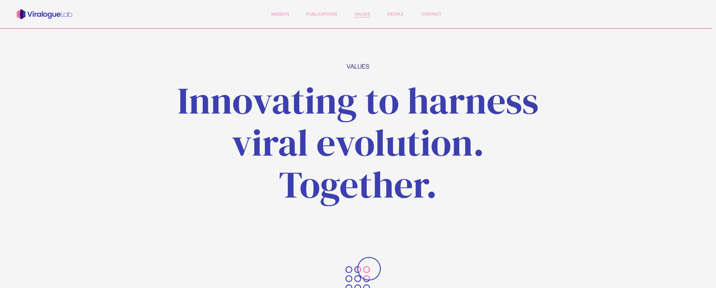
Values
For the header copy of the values section of the website, I wanted to convey a sense of community and a shared north star that everyone associated with the lab could connect with.
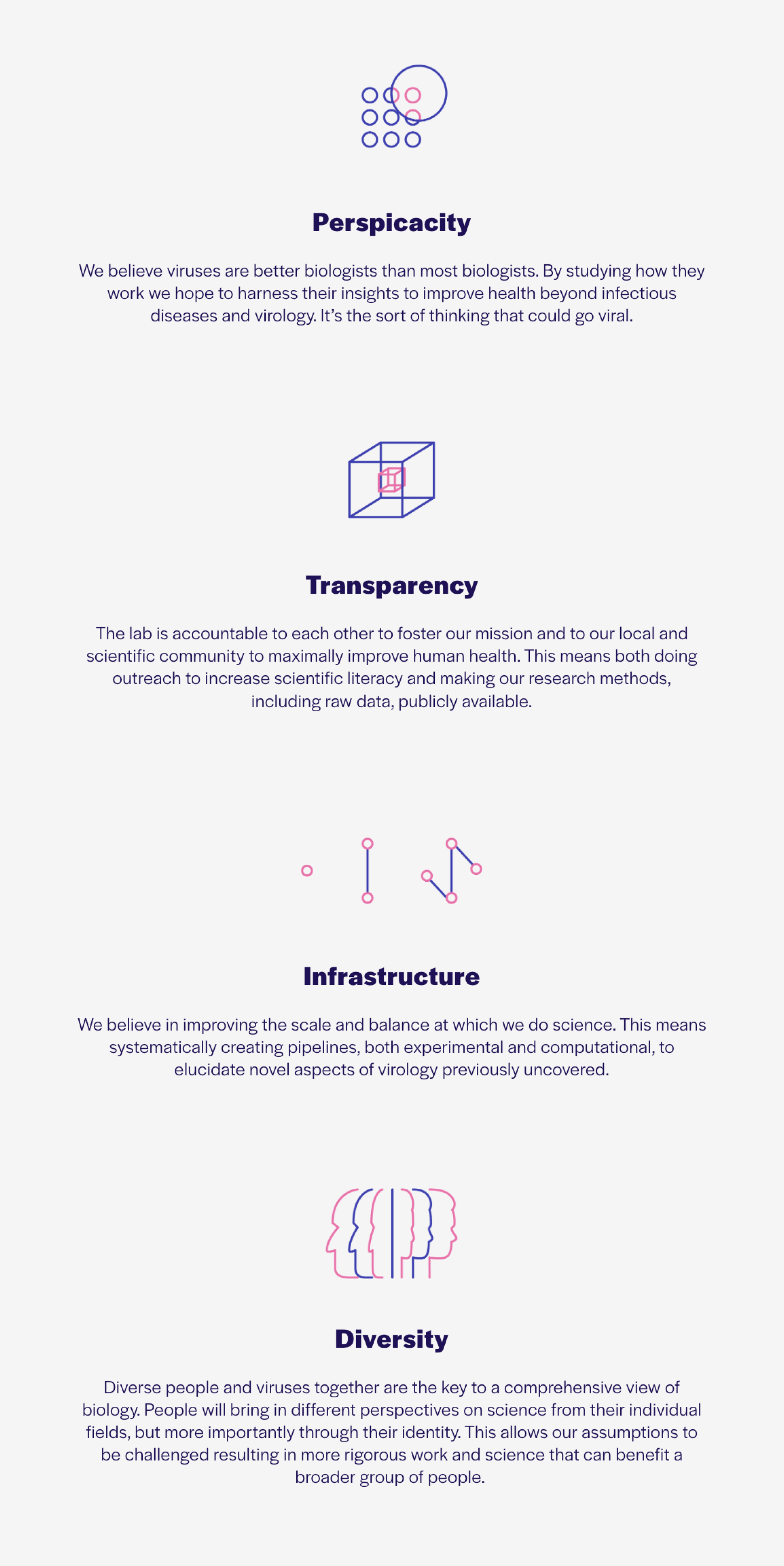
For the individual values themselves (shown below), I worked with the client to communicate each of the four pillars with clarity and aplomb. I concepted and designed a visualization for each lab value to better impress upon the reader how the lab intended to achieve its goals.
The body copy under each of the values was also another opportunity for the lab to communicate personality and wit.
People
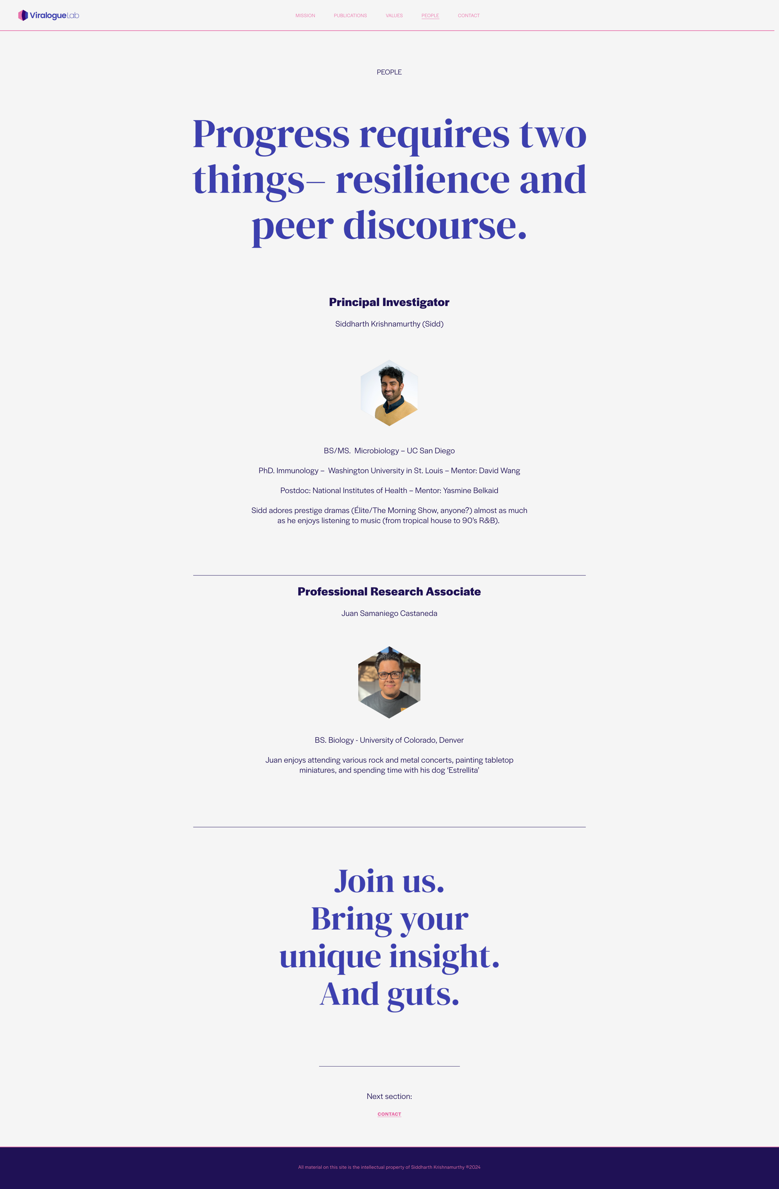
For the people page, the header copy was meant to highlight the two most important factors that all who are thinking of joining must embody– grit and being open to be proven wrong.
This page would ultimately be populated by all the members of the lab, so the header copy at the bottom of the page was meant to drive people to get in touch. Since the viral research was specifically with regards to the human intestines, this line seemed to be the perfect pun.
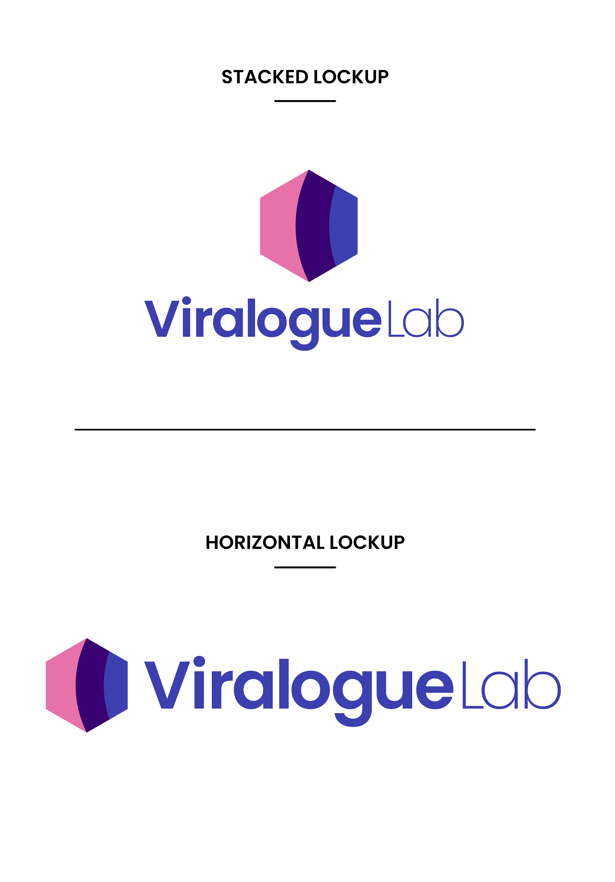
Lab logo
Since this was a brand new lab, part of what the client needed was a name and logo. Normally, a scientific research lab such as this is named after the principal lab researcher, i.e. the person who starts the lab.
However, since the goal here was to stand out, I convinced the client to buck tradition. Through discussions and many brainstorming sessions, the lab was named ‘Viralogue’ which was a portmanteau of the words ‘Virus’ and ‘Dialogue’. The research done in this lab would be regarding how the virus and the host communicate, whether that be a symbiotic relationship or not. Luckily for us, the domain name was also available.
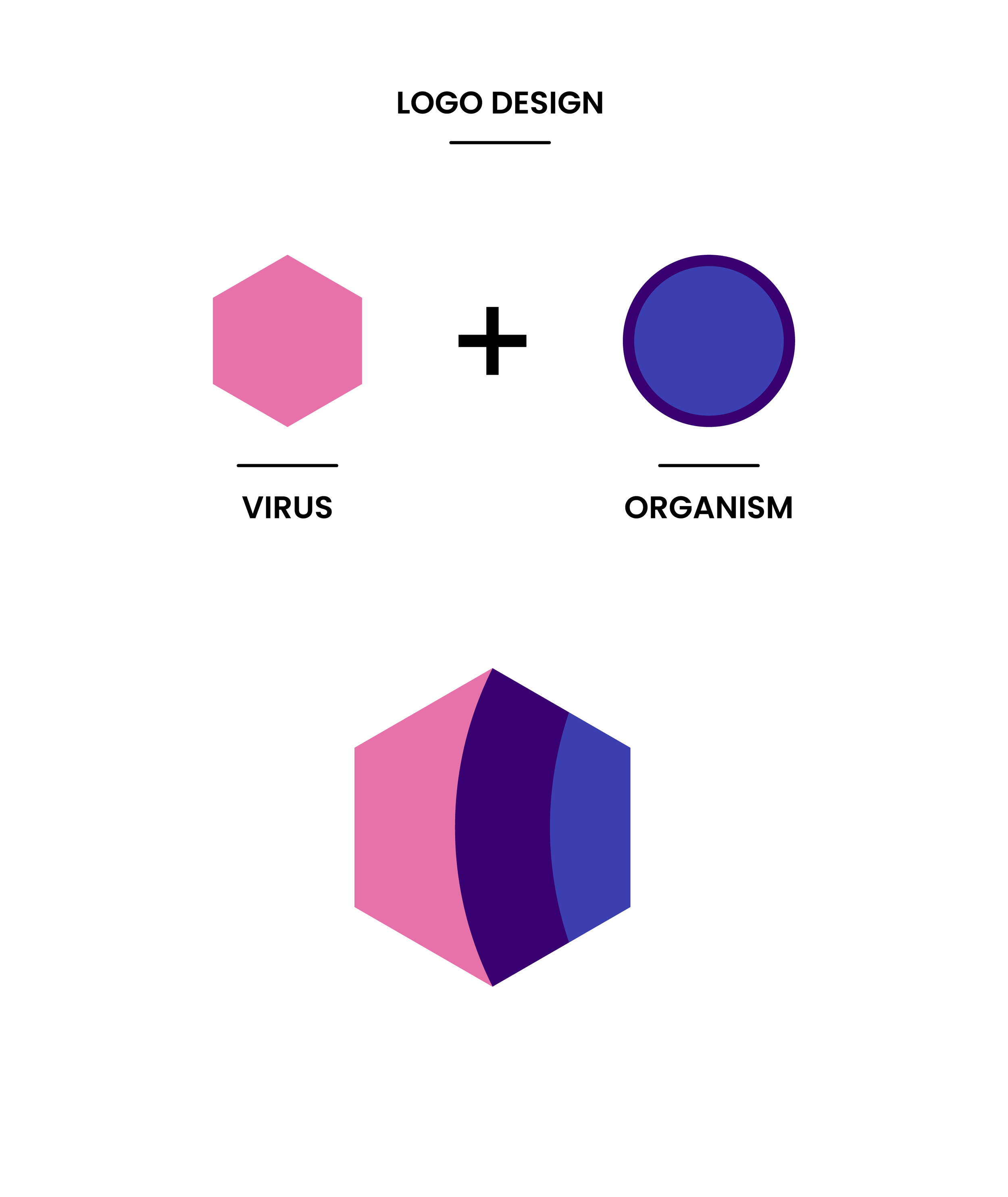
For the logo, I wanted to create a simple shape that communicated this interaction between two different organisms. In the biological scientific community, a virus is represented by a hexagon. This became the perfect starting point.
By incorporating host organism (shown by a portion of two circles, one being a ‘protective sheath’ for the host), into the hexagon, I was able to show the point in time of the virus’ penetration into the host– a critical aspect of this field of research.